Wednesday, December 29, 2010

No. 13 DEVELOPMENT

Working during the Christmas holidays has been a very difficult task BUT with the help of a lot of chocolate development has been done. Although I still believe that till the end of the unit, work would be developed more and also more satisfactory.


Initial ideas, and ways of how the queen chess could be designed differently for my use.

Developing always changing where is not satisfactory.


At this stage I decided to completely change what I was doing and think how a woman can be soft at heart. Curves showing my idea of thinking

Decided that my first idea should be more satisfying so I decided to continue working on it.

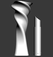
The inner container were the lipstick will be held at the process of design.

Capturing both cap and inner container, at this stage I kept in mind material and dimensions that the prototype will be done with.


Here I tried to capture how both pieces will be joined together, so that everything will click and stay in place.


Tuesday, December 7, 2010

No. 12 THE Bus Shelter

One of the very first videos I saw as an inspiration for the bus shelter was this:
http://www.youtube.com/watch?v=jeG8J6mb2HE


I then started focusing somewhat more on DNA structure and how designs have been evolved form it. I extracted the basic shape and form of double helix and started experimenting so that something else could be done.


1st experimentation on 3D Max on this particular unit.


Adding some of the modifiers to the design for development


New development

Adding more than one helix to the design.


At this stage of my development I have to keep in mind  that the final product will be done by moulded wood. So it must be a design that in the end could be worked out.

Wednesday, December 1, 2010

No. 11 Cosmetic Packaging

An assignment that I am currently working on is, to design cosmetic packaging for Toly. My first approach was to decide whether I want to design something for men or women.  It took me a long time to choose because I think both customers are challenging in different ways, in the end I decided to target women.  But not just any women either, I want to design something for those women who are now replacing men in the office, the ones that control everything that is being done at work.


From there on I decided that I will be focusing more on Lipstick packaging and the image that the woman will give once she takes it out to use it.

First board to present my concept


Second board showing 2 of my 4 concepts


Third and final board to present concepts


A presentational board to show representatives for the Toly company about my developing idea.

Tuesday, November 9, 2010

No. 10 Final presentations of the Musuem

Tuesday is the famous day dedicated to presentations and today we were also asked to present our final proposal for the layout of the Museum of Archeology in Valletta.

I believe that my group worked hard, starting from simple sketches and continuing on to develop something that is different. For the benefit of having lecturers that never saw our project I believe we have presented our project quite well, starting from the very beginning till, what has been developed so far.

But I believe that so far was not good enough at this stage. Although when we discussed the layout we took into consideration all the rooms we did not show this in the presentation, because we focused mainly on the first 2 rooms when doing small models and renderings. I think that we have spent a lot of time, trying to produce something with 3d programs, when we could have easily done it in a physical model, for the sake of this presentation and to explain more our proposal.

I believe that our next step, is to solve this and work hard so that next week we can finally present our work for the last time, in a complete way.


Picture to visualize what we had in mind.


Our experimentation with 3D studio Max.

Small Model.


Thursday, October 28, 2010

No. 9 The Design Generation of the National Museum of Archeology

One discussion leads to another, one argument leads to another, one hour leads to another, till its 14:30 and we were asked to leave the studio.


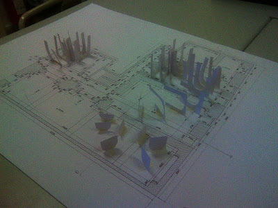
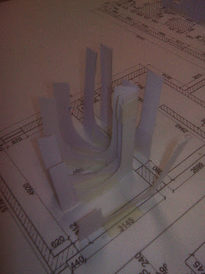
But we now have conclusions, about some parts of the design. This physical model helped us a lot in terms of scale, to see if the elements are in proportion to each other and changes in layout so that it would be better. It was much faster for us to take decisions and change plans with this model, instead of when things were only drawn on paper.


Sorry for the poor quality of the photos!!


View of the layout, although it was an early stage and many changes were done later on.


Discussing possible changes for one the rooms.

Some changes to one of the rooms.

Wednesday, October 27, 2010

No. 8 FOLDING - Design Generation

Folding is a design process; design methodology using physical modeling. The creation of a relationship between material and structure, which produces from. This process started around the mid 20th century, and some important people who forms part of this section in design are: G. Deleuze; G.Lynn; Guattari; Claude parent.

Folding – design generator has 4 transitions:

Matter and Function: Matter the paper have one constraint, the continuity of the surface, but a series of transformations could be applied to it. Fold; press; crease; pleat; cut; twist; wrap; hinge; weave; compress and unfold.

 Algorithms: Are recipes, step by step instruction of how to solve a problem.
‘When folding a piece of paper the series of transformations resulting into the paper fold artifact, is a genetic algorithm form’

Spatial organizational and structural: creating a structure with space and volume, whilst introducing topology and tessellations.


3D Prototype: The end product is a structure resulting from the whole process.

An interesting article regarding folding is found in the magazine AD 1993 "The fold: Leibniz and the Baroque: The pleats of matter."


These designs were not done by myself :) but shown during last Monday's lecture. I hope I will be uploading some of my experiments later on.


Thursday, October 21, 2010

No. 7 Neri OXMAN


Neri Oxman completed med school at the Hebrew University of Jerusalem and later on ventured to London to get a degree from the Architectural Association School of Architecture. She isn’t so much on architecture and design, she states that their revolution lies on the surface.

‘Forget about the way it looks, think about how it behaves’


Neri Oxman herself.


Holding her fabrication of skin-like membrane, done with a 3d printer


Her work is more on material ecology, and studies how the material reacts, in a way to suite the need of people. To produce a different kind of design is to start thinking and looking also at material in a different way.


This video shows Oxman speaking about designing form. At some point she states 'What does a material want to be?' The only reason that a chair is of a certain design is because we have decided it should be this way, but what if we look at what the material can do and give us, what if we take it to its limits?

Wednesday, October 20, 2010

No. 6 Sketches of FRANK GEHRY

This is going to be the next movie / documentary that we should be watching.. I haven’t seen it myself, but taking a look at the trailer should give us a hint of how this architect’s mind work.

‘That is so stupid looking its great’ he said in the trailer.. Maybe we should start thinking this way.. Not to be practical, but there should be no limits to our design.

His architecture is a breath of fresh air, a new way to look at architecture. We need a breath of fresh air at that old museum :) 

Thursday, October 7, 2010

No. 5 To Think outside the Box.


This video has nothing special, but the last part, made me feel that if I think beyond, I can create anything I want, with any material...

We need to think outside the Box a lot!!

Monday, September 27, 2010

No. 4 New Approach

Being in the digital era we are now encouraged to develop more computer programs, rather than sketching the traditional way. I was actually researching some information about the new times in design and came across this article, which in some ways and after reading it made quite sense to me.

I believe that we are living in new times and we have to start changing our ways of doing things, this one is about design.


Thursday, September 23, 2010

No. 3 Presentations

Criticism is the judgement of the merits and faults of the work or actions of one individual by another (the critic). To criticize does not necessarily imply to find fault, but the word is often taken to mean the simple expression of prejudice or disapproval.
Another meaning of criticism is the study, evaluation, and interpretation of literature, social movements, film, arts, and similar objects and events. The goal of this type of criticism is to understand the work or event more thoroughly.

Gabriel: His presentation was flowing from one slide to another, showing various works and materials he has worked with during the past year, especially. Captured the audience attention from the very beginning and that is a very good asset. Finally I think it is very good to criticize your own work, but you have to be very careful, because at that stage you were showing your work, and you have to make us believe that you believe in it.

Sirach: A very good presentation showing your work, mainly ceramics although it shows that you have experimented with other materials. At some stage I expected to see something different because the slides seemed to be all with ceramic works, which seems very much like your slides because the pieces seemed to have some things in common.

Richard: I found you quite informative, and cool while presenting, you were very confident about your work. I have to admit I never liked sketch up much, but I think you did quite a good job with that interior.

Stephanie: You said it yourself, you have more to look back to, and you clearly showed different areas you worked in. I really like your object drawings, because you manage to include every detail. Above all, your work shows your style, and I think your own work shows improvement, throughout stages in your life. Welcome to the new one, the DIGITAL ERA (which I know you hate with a passion).

Ishmael: You showed a lot of various works in wood, and other materials of course, which is very good. You also mentioned techniques used which were various. Although I don’t like much the photo editing, I believe that it’s your style and you manage to show it throughout, because nearly all photos seemed to be edited. (I believe editing is very good and I love it myself, but sometimes especially when you want to sell, it’s better to present it as simple as possible, because you have to show that it already looks good without the editing).

Cassandra: I believe you improved a lot, and your work is really good, simple and presentable. Know I think you have to start believing in yourself and your work, because I am sure it will help you make another step forward.

Christine: You had final pieces, couldn’t you say something more? I believe you needed to give more information, because there was a lot of silence, and it looked like you weren’t confident about your work, (when you should be).

Christian: Different materials and experimentation. I envy you for having such knowledge on 3ds max and how you go around with it.

Lorriane: Same as Chris you have a wide range of experimentation and knowledge on materials. Also some 3d knowledge.

Martina: I think your paintings from A-level are great and it seems you worked on different areas on art not just on the design part. The model of last year’s assignment looked very good and showed that you worked hard, and when you mentioned a different material that you used, I think was really good because no else did, and you showed that you not only researched basic materials that one find in workshops.

Cristina: I think you are hard working; really got some good ideas to project but just don’t state ‘din ghal qalbi hafna’.  It’s not enough to sell. I think during the last year you’ve been here you managed to experiment with a lot of different materials, which is very good.

Nicole: I believe your use of pencil is unique. Something which I really admired is that you managed to incorporate something you love to do i.e. Modelling with your work. The change of workshop I believe helped you a lot.

Mark: I could hear you doing your presentation!!! I think you might have some really good ideas of design like that of the chair, now be more confident. After all the hard work you do in wood, you deserve more!!

Sarah Jane: I think everyone, must have realised that your favourite work was the crime scene. The moment the slide arrived, your face brightened up. I think you need to start working more with precision and neatness. Also a good composition of slides, but sometimes they were too crowded for a simple 15 seconds.

Vanessa: I believe at this stage everyone ones that you love working with organic and linear, cause you mentioned it with every slide. I believe you have a quite unique style, and use it well; the chaos thing need to be more organised to be a good chaos idea. Or else everyone will be lost looking at your slide without understanding anything there is.

Tamara: I think you would have done great also in graphic design. At least my first impression of your presentation, and I can very easily imagine you thinking out of the box, cause your ideas I believe are simple but very effective. I think it’s time you get your hands dirty know.

Elisa: A lot of your slides showed the same photo shoot, I believe you worked hard for that one. What I found interesting in your presentation was the final one, you put the piece to test, by giving it directly to children to play with. Very helpful for evaluation.

No. 2 Achille Castiglioni

Achille Castiglioni was a renowned industrial designer, often inspired by everyday things and made use of ordinary materials. He uses the minimal amount of materials while creating forms with a maximum effect.


I have decided to start, with this designer because I have already researched a lot of his work in the past, and always found him encouraging. That is why, usually when I am given an assignment I always find it very difficult to inspire myself from things. Reading about such designers with this experience, helps me to look at every day things which can be inspiring.


Achille Castiglioni himself; known for his lamps principally for Flos, although he also worked for Danese and  Alessi.


ARCO
Production 1962 - Flos

Provides direct light, satisfying the need for direct light on a table without having to fix it to the ceiling. The base of the lamp is a white marble parallelepiped with rounded corners weighing about 65 kg.

Friday, September 17, 2010

No. 1

Well being that I am new to this sort of thing, I am going to be polite and say hello to anybody who took the interest to read my blog.


I am now the girl with a blog, and will be using this space to right some of the stuff that comes in my head, especially related to 3d design. Not only the thoughts but also some of my research. (Right now I am feeling very green cos you can imagine this sort of thing used to be done on sketch book in previous years...)


Anyways, may this be the first step (hopefully not last);  to my new life of BLOGGING :P


ver